How do you get people to give you their email address so that you can build your contact base or email list?
We know it’s tricky!
Lucky for you, we’ve gathered the 14 best opt-in email strategies for you.
In this blog post, we’ll discuss the differences between single and double opt-in email, and then show you some incredible ways to entice customers to subscribe to your email list and ultimately become loyal customers.
We’re talking social media, testimonials, privacy statements, A/B testing, and more.
We’ll also show you how you can exploit FOMO to your advantage.
Happy reading!
Table of Contents
What Is Opt-in Email Marketing and Why Is It Important?
So what’s opt-in email marketing?
To incentivize your visitors to join your email list, you offer them a lead magnet, a piece of content, or even a freebie.
Your ‘lead magnet’ needs to have enough value for visitors to join your mailing list. The concept of value differs depending on your audience segment.
Some want to learn something that will help them improve their business. Others want to save money. If you offer value, then it becomes hard for them to resist joining your email list.
By offering their email address, they hope to receive quality content and resources that can benefit them.
The opt-in email offers a taste of what’s to come.
Enhance Your Email Marketing
Want to make your emails more impactful? Check out our beautiful, easy-to-customize HTML email templates. Designed to boost engagement, these templates from EngageBay will help your emails stand out. Just customize the images, headings, and CTAs for your brand, and hit send in a few minutes!
What’s the Difference Between a Single Opt-In and a Double Opt-In?
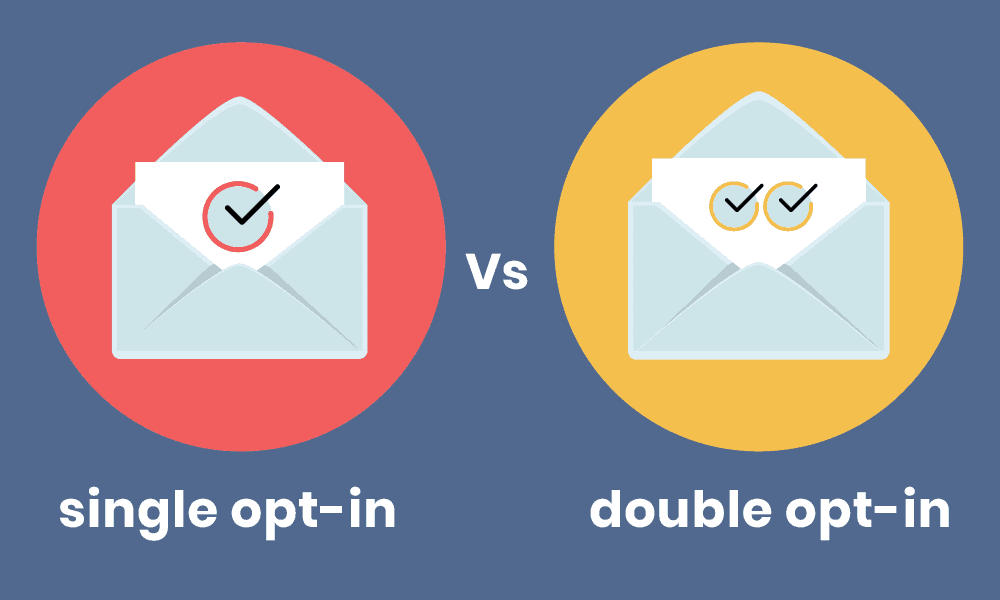
There’s more than one type of opt-in email strategy you can employ for your small business. For instance, there’s single opt-in, and then there’s double opt-in.
What’s the difference between these two?
Single opt-ins, sometimes called SOIs, are somewhat self-explanatory. The lead only has to give you their email address for your email list.
Then boom! They’re subscribers.
Your leads will receive your welcome email, and you’ll begin the nurturing and engagement process to convert them into buying customers.
Single opt-ins make it very simple for your lead to finish opting in through the forms and sharing their email address, and they can immediately begin receiving content and value.
Then there’s the double opt-in. As you might have guessed, this requires an extra step before the lead can complete the process of opting in and joining your email list.
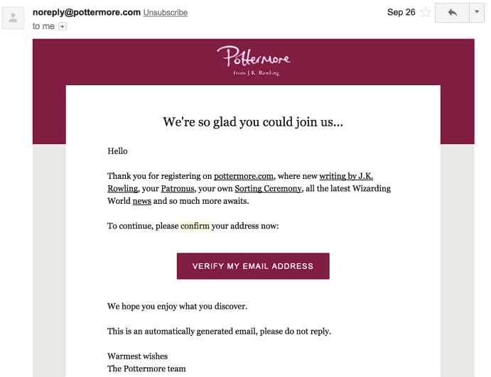
Have you ever signed up for a service and then received a confirmation email to your email address to proceed with the registration?
You had to finish the registration via a link in that email to complete the confirmation step, right?
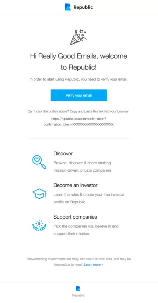
That’s a double opt-in email in action. If you only do the first part of the process, then you’re not wholly subscribed. This ensures that the people subscribing to your mailing list are authentic and want to read your content.
In a way, a double opt-in email (also called subscription confirmation email) improves privacy and email deliverability — the subscribers are willingly offering consent to send them marketing material.
Here’s an example of double opt-in email marketing:
Why do some companies go to the effort to set up a double opt-in process? There are two reasons. The first, the simpler reason, is to cut down on spam.
No one wants an email list populated with spam accounts. This can inflate a contact email list to the point where it looks healthy, sure.
However, once you cut down on all that unwanted spam, you quickly see your email list doesn’t have nearly as many subscribers as you thought you did.
The more significant reason for double opt-ins? It shows a higher level of dedication and interest.
Since it takes an extra step to finish, the leads that bother filling out the double-opt-in prove that they’re more committed to becoming a part of your email list.
Others with lesser interest will see that they have to go through a second step and decide not to opt-in to your email list at all.
Read also: How to Write an Introduction Email to New Subscribers
What is Implicit Opt-In?
An implicit opt-in occurs when a visitor/customer fills out a form (could be for anything — event registration, downloadable, etc.) without the explicit consent of receiving marketing emails.
For example, you sell marketing automation software, and you also have an online academy with resources on marketing automation. A person buying your software offers their email address during the transaction, which is added to your database.
Here, you add information in your privacy policy telling the user that purchasing the product gives implicit consent to receive marketing emails.
Though the customer has not explicitly consented to marketing emails, you can send promotional emails. Though risky, this is a good way to build your database quickly.
Read also: How to Create Great Email Newsletters [with 7 Free Templates]
The 14 Best Opt-in Email Strategy Examples
By this point, you know your company needs an opt-in email strategy. You’re just not sure how to go about it. Luckily, these 14 opt-in examples ought to give you a great starting point and the best practices to get the most out of your email campaigns.
#1. Use social media, especially Facebook Ads
As a small business or startup, you’re surely on social media, right? You may even have a decent-sized following across several channels.
If you do, then why not use Facebook Ads and other social advertisements to bolster your email opt-in rates? While this isn’t free, it’s a useful measure.
What if you’re a pretty new business, and you don’t exactly have thousands of people engaging with you across social networks? That’s okay.
You can use the Lookalike Audience feature on Facebook. With this, Facebook reviews the audience you do have on the site to determine what untapped portions of the social audience you can market towards.
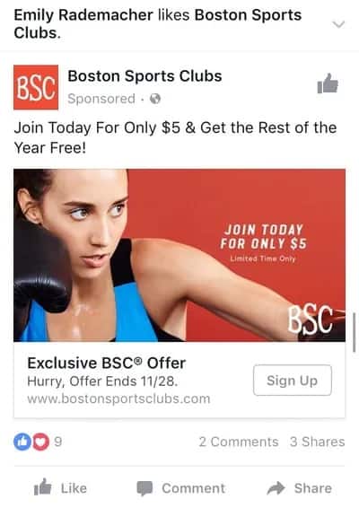
Here’s an example Facebook ad that clearly shows what they are offering. The CTA, along with the content, clearly describes what the user is signing up for.
#2. Create a privacy statement
Customers care about their privacy. Period.
If they give you their information, they have one chief concern: what do you plan to do with it?
They don’t know you that well, after all. They want to make sure you’re not going to spam them ten times a day or sell their email addresses to another completely unrelated company.
That’s why your company needs a privacy statement. This should appear on the opt-in forms before the lead signs up.
Image courtesy of Pam Neely
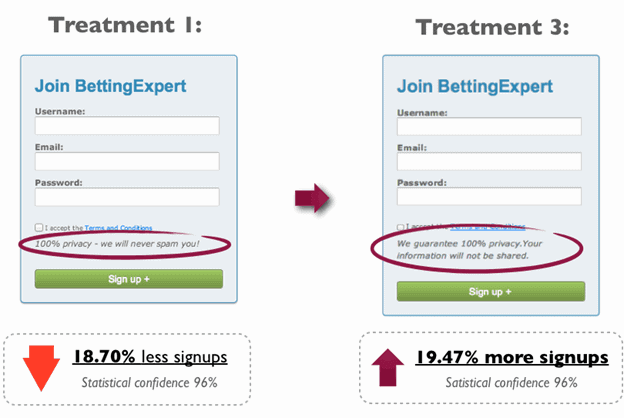
Having a privacy policy on your opt-in form gets results. Check out these surveys from email marketer Pam Neely. The first policy says, “100 % privacy – we will never spam you!”
It’s okay, but it’s not very informative. Plus, the informal tone can put off some would-be customers. Such a privacy policy will reduce the rate of opt-ins by 18.70%.
This occurs even with a statistical confidence rate of 96%.
Compare that to the language in the second policy. That one reads, “We guarantee 100% privacy. Your information will not be shared.” That says a lot more, right?
Read also: Re-Engagement Emails 101: A Guide [With Templates]
#3. Give out freebies
As a small business owner, you might not have a lot of free time, but you still have to think about what it’ll take to incentivize leads to sign up for your email newsletter.
If you’re not always working on something new to give them, then you’re at a disadvantage.
Freebies work because, well, they’re free. Just because something is free doesn’t mean you should put any less heart and soul into it, though.
Yes, it’s true, you’re not making any money from this content now, but it can pay back dividends if done correctly.
You can write blog posts that don’t go on your website but only to new subscribers. You could compile a list of great resources as an exclusive.
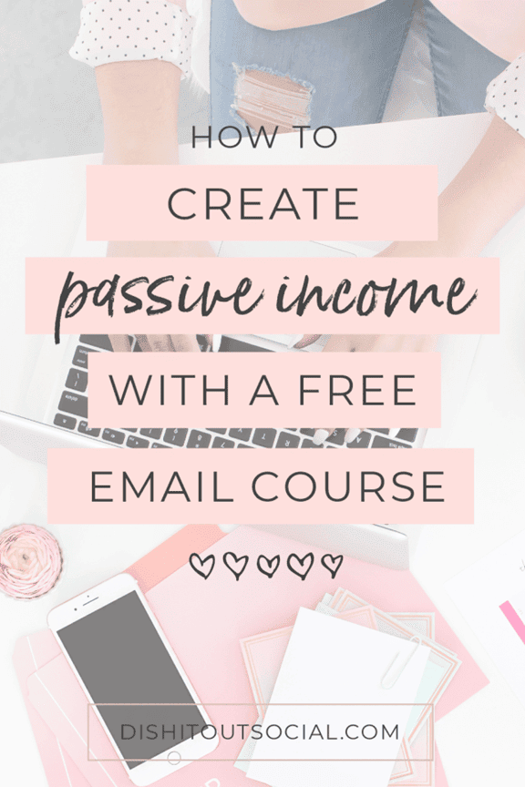
You might even write a free e-course just for those you want to encourage to opt-in to your email list.
Here’s a great example:
Read also: 14 Inspiring Newsletter Sign-Up Examples From Top Brands
#4. Write awesome CTAs
Arguably one of the most important elements of a landing page or marketing emails is the CTA or Call-To-Action.
Boring text like “download now” won’t do much for those leads on the fence. You want a CTA button that sings. Look at this one for a Crazyegg course.
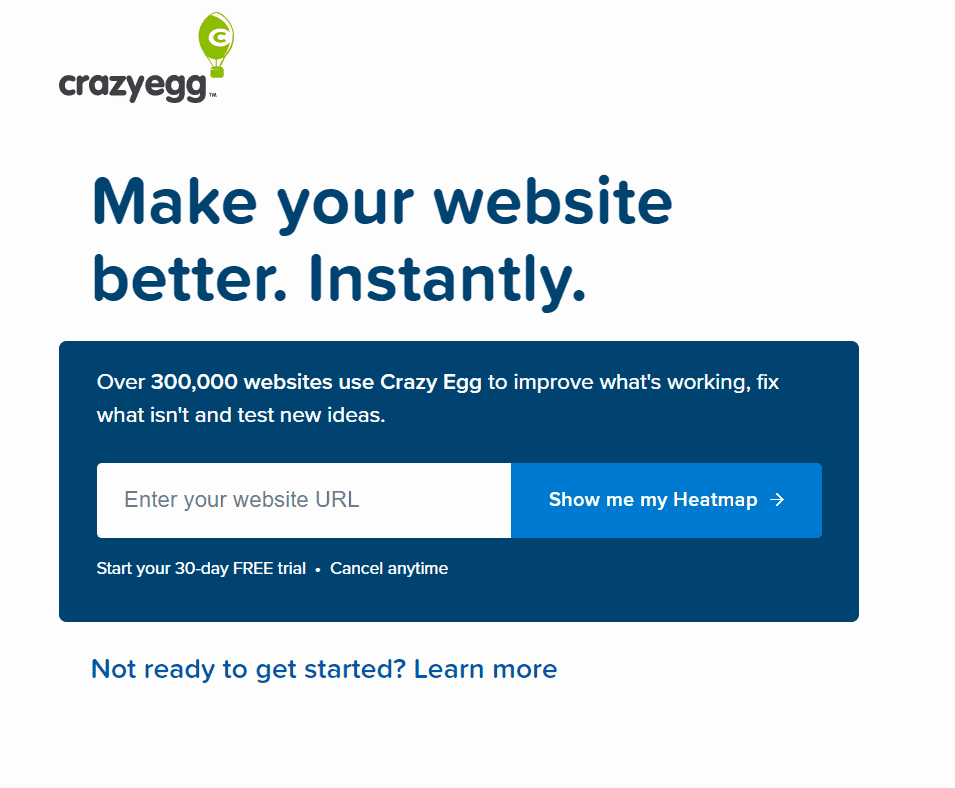
It says, “show me my heatmap.” What’s a heatmap? If you don’t know, you’re going to want to click because it seems like knowing your heatmap will help improve your site.
eCommerce Email Marketing Simplified: 15 Examples + Tips
#5. Create a sense of FOMO
Here’s another strategy for improving your opt-in marketing that’s also related to your CTA. It’s FOMO, and it’s quite real!
With everyone parading their lives on social media, you can always know what your friends, coworkers, and even old high school classmates are up to.
The more people that do the same thing, the more you want to join the crowd. This psychological herd mentality, which we’ve written about before, makes for a handy digital marketing tool.
If you can tell your reluctant lead how many other people have downloaded your opt-in offer, wouldn’t you?
It turns out you can.
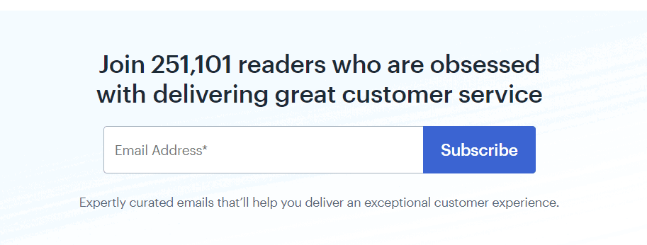
Just look at what customer service company Help Scout did for their CTA. They tell you how many people have already signed up for their newsletter.
Adding a number like this for FOMO purposes also showcases your company’s value.
That can push reluctant leads to share their email address finally.
👉 Need a break from your email marketing hustle? Have a laugh with these relatable email memes for marketers!
#6. Revise and redesign your opt-in form
Sometimes, a lead’s decision to not opt-in might have nothing to do with them not wanting to give you their email address. They might not even mind your two-step opt-in.
What they don’t like is how your opt-in form looks.
That’s a fair complaint, especially if you used some basic form template years ago and haven’t touched it since.
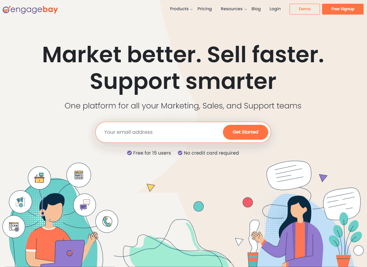
To inspire you to create a more appealing opt-in form, here’s our own recently redesigned home page with a CTA that makes it super easy for interested visitors to sign up:
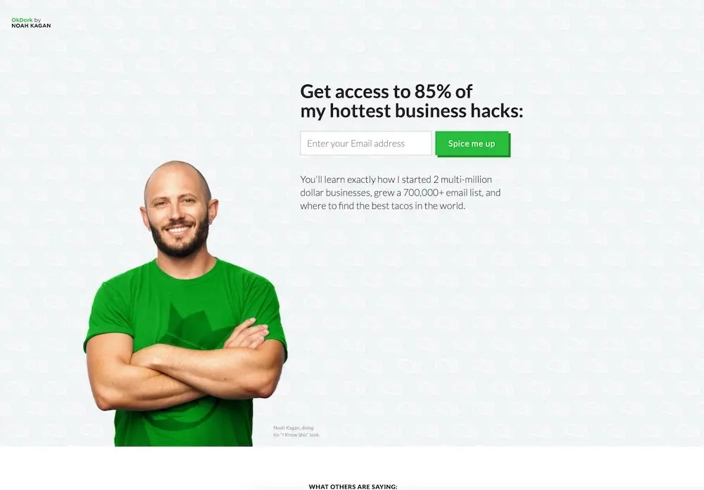
Here’s another great example by Noah Kagan — a simple, minimal CTA:
#7. Use exit intent pop-ups
Let’s say your opt-in didn’t work. What’s next?
You could use what’s known as an exit popup. With this, you get one last chance to swoop in and try to save the day. This popup only triggers right before the lead clicks off your site.
Besides trying to win the lead back, you’re also trying to get their contact information. See what we mean in the example below:
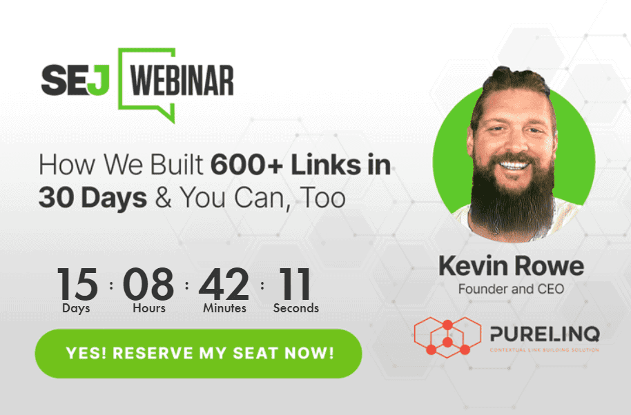
The pop-up tells website visitors that they can learn how to build links from a webinar, and it doesn’t even explicitly ask for the email id. If you click on the button to reserve your seat, you’ll be redirected to the webinar landing page where you can enter your details and sign up.
Isn’t that neat?
👉 Discover the most effective marketing strategies that can transform your campaigns.
#8. Include social proof
Another powerful tool you have in your arsenal is social proof.
Before you buy any new product for the first time, you probably comb through the reviews, right? Maybe you watch a video or look at images of the product in action as posted by real users.
That’s because we’re somewhat jaded consumers. We know any company will try to make its product look like a million bucks.
If it’s a five-buck product instead, then reviews will expose the product for what it is.
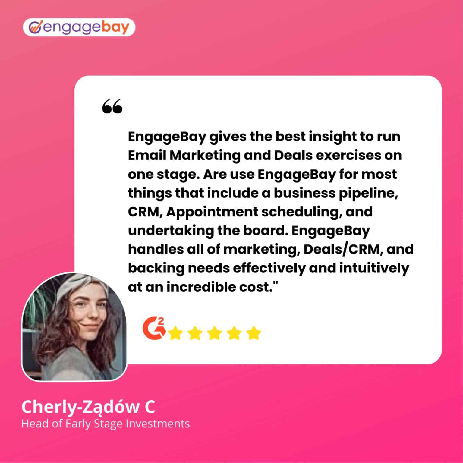
One popular form of social proof includes testimonials and reviews from real customers. If the product changed a customer’s life, then that works as solid social proof. If you have such a review in your back pocket, now’s the time to pull it out.
Here’s some social proof for EngageBay:
#9. Entice with a lead magnet
Throughout this whole article, we’ve talked about offering value. That’s how you hook in leads and get them to opt into your email newsletter.
One of the best means of providing value? Lead magnets.
Lead magnets work so well because of their great versatility. You can send your email subscribers a video, a whitepaper, free email templates, several chapters of an eBook, a report, a PDF checklist, or blog posts.
There’s no limit to what you can do if it’s valuable.
Here’s one example from EngageBay:
#10. A/B Test
We saved our most important point for last. As this article proved, there’s a lot you can do to make your opt-in emails more effective. We’ve mentioned a lot of techniques in this blog post. Make sure you A/B test them!
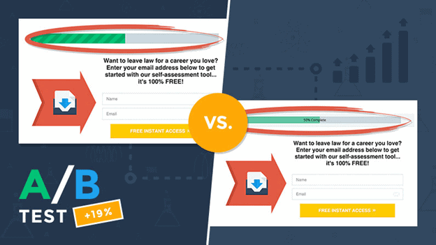
Sometimes making your opt-in more powerful comes down to minor tweaks, as seen above.
You want your opt-in emails to perform as well as possible, and they can only do that if you A/B test them first.
Read also: What is Permission-based Marketing and How Does it Work (Examples)
#11. Do not purchase email lists
We know the temptation of choosing the easy way out by purchasing an email list. While it may look like a sound strategy to jumpstart your email campaigns, it does more harm than good in the long run.
Purchasing email lists is a surefire way to mark your emails as spam — as purchasing email lists means you don’t have any engaged readers. Engagement improves email deliverability and visibility, so take the time to build a list organically.
In the long run, this will help you tremendously.
Read also: Email Marketing Vs Marketing Automation: A Marketer’s Guide
#12. Go for a double opt-in strategy
While single opt-in is a great strategy to improve your email lists, using double opt-ins ensures that your subscribers genuinely want to engage with your contacts.
This keeps your email lists clean and ensures your subscribers are active and dedicated.
Have a confirmation step in your opt-in process — this also ensures that you are compliant with new legislation that require double opt-ins.
Here’s a great example of double opt-in from Republic:
#13. Get feedback from your subscribers
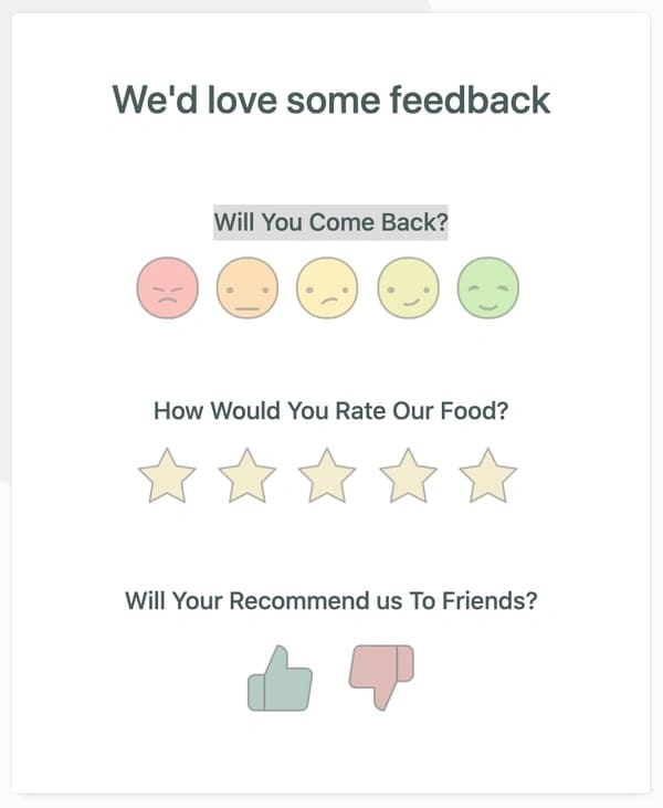
Don’t market blindfolded. Listen to your audience and ask them for feedback and input. This can help you shape your campaigns and products the right way.
You can get feedback through an email as part of your email series, or even through triggered emails. Incentives help a lot here and improve the chances of successful interaction.
Honestly, it’s a win-win situation.
Here’s a great example from FormCrafts:
#14. Be transparent and let your subscribers manage their preferences
The tide is shifting in favor of privacy and transparency, and you must be at the forefront of this change. Giving your subscribers the opportunity to tweak their preferences goes a long way in showing that you care about their time and privacy.
If you offer an all-or-nothing scenario, most people would definitely choose the latter. Wouldn’t you do the same?
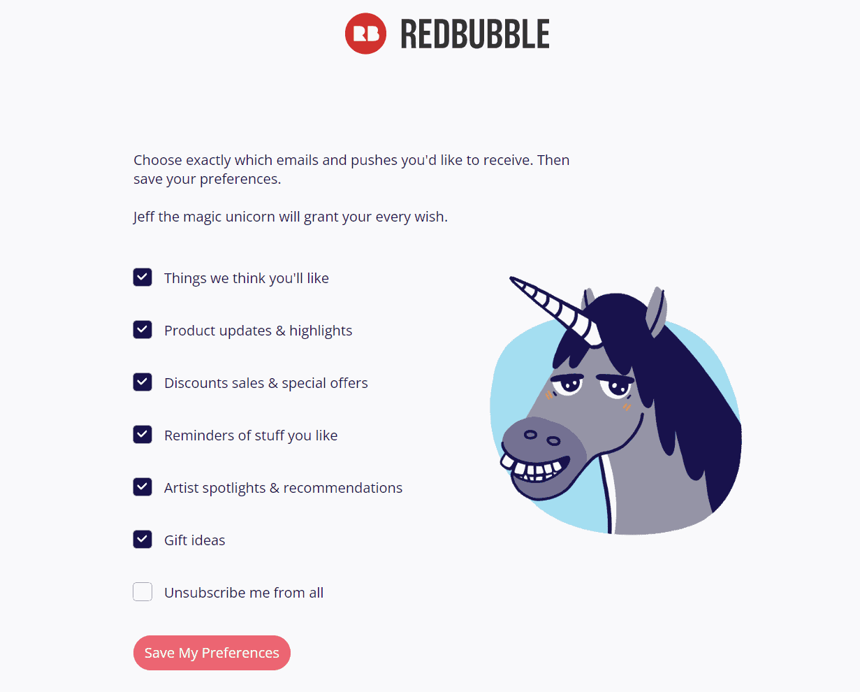
Have a preference management center or dashboard to help them choose the frequency and type of emails, and the amount of personal information your subscribers are ready to share.
This will drastically reduce unsubscription rates. Here’s a great example from RedBubble:
Read also: 15 Email Marketing Examples to Inspire Your Next Campaign
10 More Opt-In Examples to Inspire Your Own
We’ve combed the internet for the best opt-in examples to help you create your own. Let’s get started!
#1. Larry Law Law
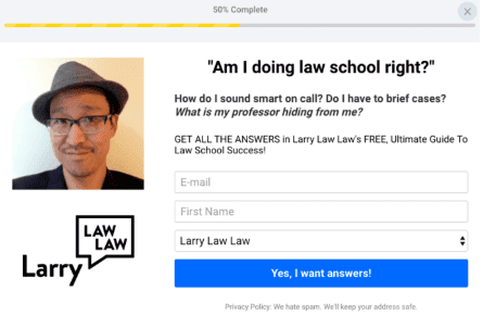
“Am I doing law school right?” is a question most law school students will have, and this captures the essence. It’s relatable, eye-catching, and can result in more sign-ups.
#2. Morning Brew
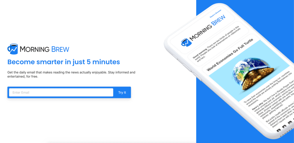
Amazing design. Amazing content. Amazing visuals.
This is one of my favorite opt-in examples. The image shows exactly what they are signing up for.
#3. Frank Body
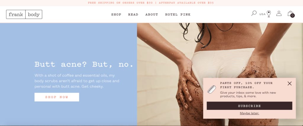
A simple, straightforward opt-in example with clean, minimal language is a great way to boost signups.
The opt-in form popups from the bottom, but is still above the fold. The discount is an added incentive to nudge visitors to subscribe.
Read also: Make No Mistake: Email Marketing Automation Best Practices
#4. Content Marketing Institute
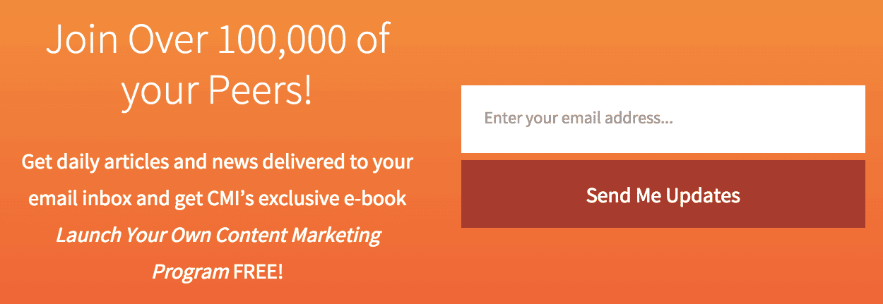
This opt-in form from CMI takes advantage of FOMO to make visitors want to join in on the action. The clear CTA, button placement, and brand theme all come together, making this a great opt-in example.
#5. Bonobos
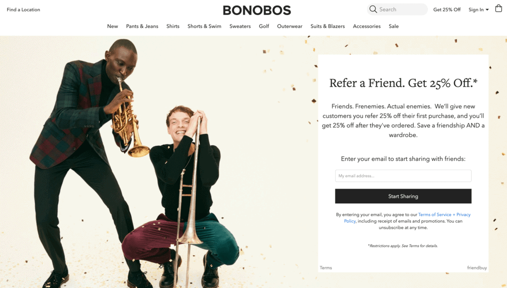
A referral program is a great way to build your email lists and make your subscribers do the work for you. In order to join the referral program and get rewarded for recommending your product, they need to enter their email.
Bonobos does a great job at this by having an aptly placed opt-in referral form with a reward.
#6. Blue Bottle Coffee
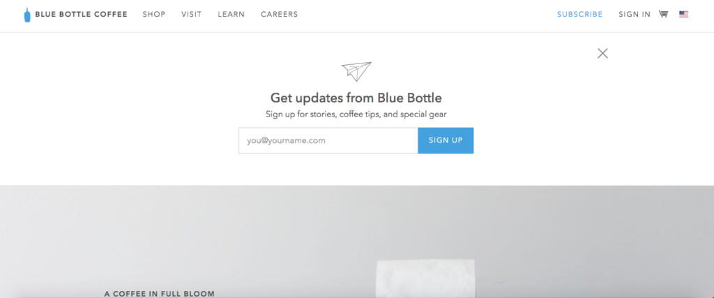
Blue Bottle Coffee is known for its minimalistic design elements — and I’m all for it. This opt-in form is the first thing you see when you land on their website.
The copy is clear and to the point, making this one of the best email opt-in form examples.
#7. Neil Patel
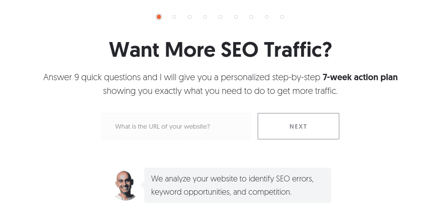
This exit-intent opt-in form from Neil Patel captures the reader’s attention, and the copy explains the target audience’s pain points rather than just pushing visitors to sign up.
Visitors sign up by offering their email and other details and then get their hands on Neil Patel’s 7-week action plan.
#8. Everlane
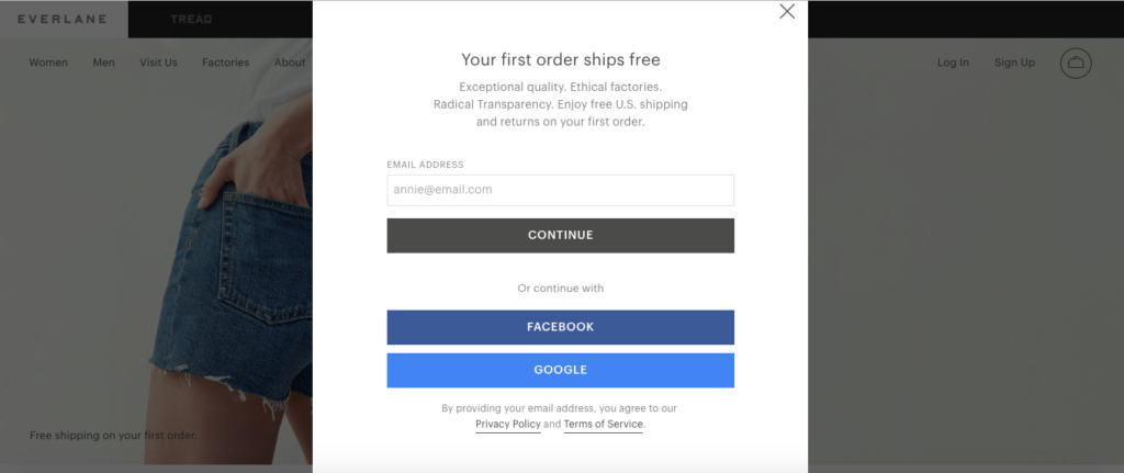
Everlane’s popup opt-in form mentions “your first order ships free” at the very top — a great way to grab the reader’s attention.
The simple but powerful copy that follows further grabs the reader’s attention: ‘Exceptional quality. Ethical factories. Radical transparency.’
#9. Chameleon
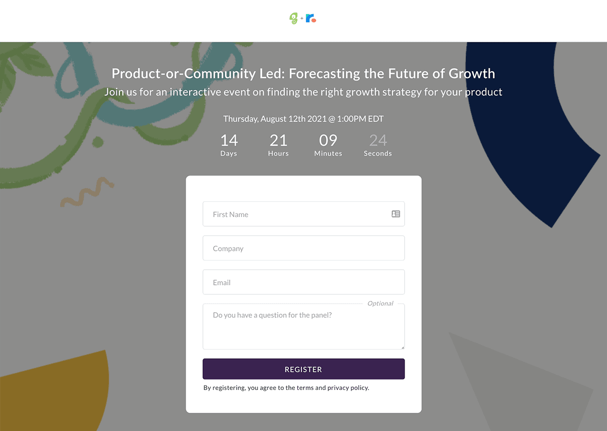
This webinar opt-in form from Chameleon displays a beautiful timer to invoke a sense of urgency, thus convincing readers to subscribe immediately.
Plus, webinars are a great way to get email addresses, as it offers valuable content in return.
#10. Modern Me Boutique
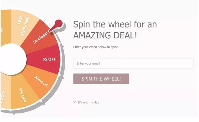
Interactive opt-in forms are gaining popularity these days, and for a good reason. It improves user engagement, and the prospect of winning something nudges users to try it out.
The ‘Wheel of Fortune’ opt-in form from Modern Me Boutique is a perfect example of a creative opt-in form.
Read also: 14 Great Win-Back Email Examples Customers Can’t Resist
Conclusion
Now that you’ve seen the different opt-in email strategies, it is time to put them into practice. Though there are dozens of email marketing software out there, you need one that caters to all facets of your business.
There’s a caveat, though. Most platforms are quite expensive and become unbearably costly as you scale your business. That’s where EngageBay is unique.
EngageBay is one of the most affordable software on the market today. It’s an all-in-one marketing, sales, and customer service software that offers everything you need to keep your business running smoothly. Oh, and you get a free integrated CRM.
EngageBay’s opt-in tools give you complete control over your email list-building process. You get single and double opt-in features, segmentation, a drag-and-drop email form and landing page builder, email marketing campaign management, free email templates, exit-intent popups, A/B testing tools, a social suite, and email marketing automation.
The best part? It’s priced so that even small businesses and startups can easily afford the software while also being scalable. Even the most advanced plan costs under $100 a month.
Compare this with EngageBay’s competitors that charge hundreds or even thousands of dollars a month for similar features, and you’ll know what we’re talking about!

Great blog! Do you have any helpful hints for aspiring
writers? I’m planning to start my own site soon but I’m a little lost on everything.
Would you propose starting with a free platform like WordPress or go for a paid option? There are so many choices out there that
I’m totally confused .. Any tips? Cheers!