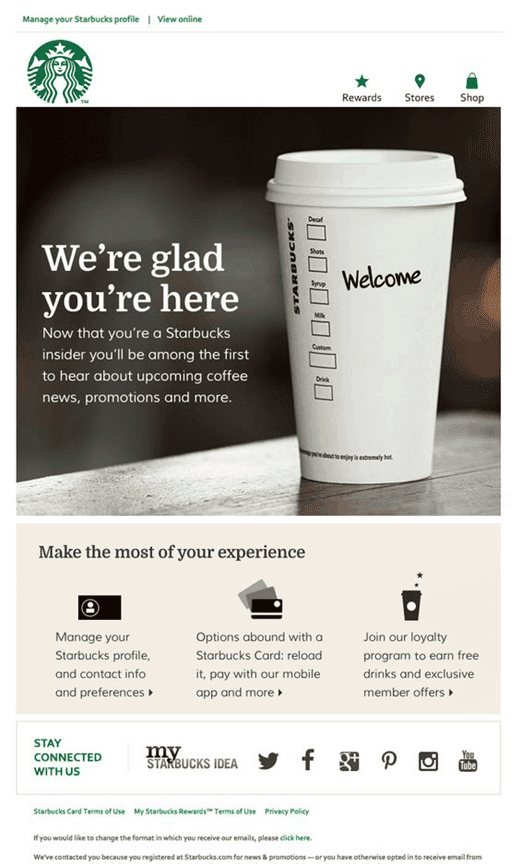
A shiny new email arrives in your inbox from a company you like doing business with. You excitedly open it and see a slew of impressive graphical elements, neat links, maybe even some interactivity or a video.
In short, it looks sort of like this.
Image courtesy of MailBakery
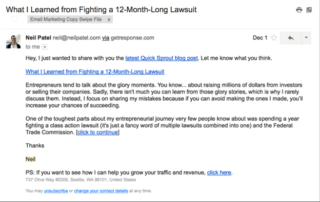
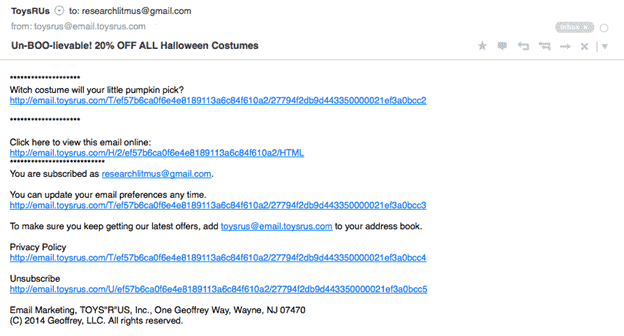
Then you get yet another message in your inbox. It’s not formatted nearly the same. There’s no images, videos, or interactive elements. Here’s what we mean.
Image courtesy of Litmus
These types of emails are incredibly different. The first one uses HTML while the second is plain text. In this email, we’ll explore both email formatting types. First, we’ll define them, then explain the differences between the two. We’ll also tell you when to use HTML and when to favor plain text for email marketing campaign success.
Table of Contents
What Is HTML Email?
Let’s begin by discussing the HTML email format. Hypertext Markup Language or HTML email can achieve visually amazing things. You can display hyperlinks, graphics, colors, fonts, images, and videos in your emails. That makes your content look phenomenal, such as the image we showed you in the intro.
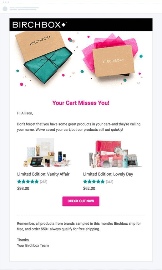
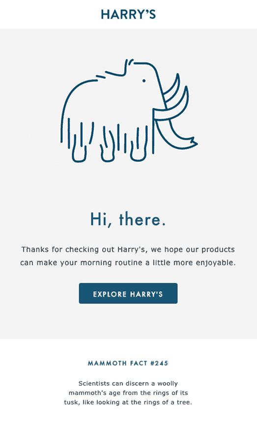
Here’s a few more examples of HTML emails that showcase the wealth of capabilities you have with this email format.
Image courtesy of MailBakery
Image courtesy of Pinterest
Image courtesy of Instapage
Now, HTML emails do require a degree of coding knowledge. You could always tap into the expertise of someone who grasps coding better than you do by hiring a third party.
What Is Plain Text Email?
Then there’s plain text email. This strips back all the visual elements you’d see in an HTML email. You won’t find any fancy interactivity, videos, or even images. Yes, that’s right. No images. Instead, plain text emails look as plain as the name would suggest.
Plain text existed before HTML, which in part explains its simplicity. You don’t need to have a vast coding knowledge to grasp how plain text emails work, since they’re formatting-free. You don’t even have to worry about making font choices. Instead, plain text uses mono-spacing, a type of font where the spacing of each character is consistent.
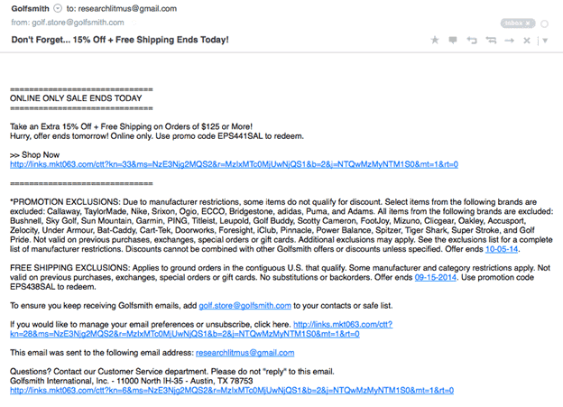
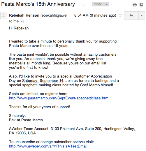
Check out some more examples of plain text emails.
Image courtesy of Send Check It
Image courtesy of Litmus
Image courtesy of AWeber
What Are the Differences Between Them?
When pitting HTML vs plain text against each other, what are the differences? There admittedly aren’t many.
One Has Lots of Visuals and the Other Doesn’t
As we covered already, HTML emails can look like pretty much anything you can visualize. Do you want an email with a giant video the recipient can watch when they open the message? Done. GIFs and animations? No problem. Gorgeous, high-res images? Easy. Interactive elements like scratch-offs or coupon code revealers? You can do it.
With plain text emails, you can’t ever have any of those elements. You can’t even adjust the colors. It’ll always be black text on a white background. You’re even stuck with the same font, as we talked about in the last section. There’s very little individuality here and thus less of a chance to let your visual creativity shine.
HTML Requires Semi-Extensive Coding Experience
While your final product might look super cool in an HTML email, these emails don’t just materialize out of thin air. You or someone else must code in all the elements so they appear. This article from SitePoint breaks down how you’d even begin to go about doing that.
Here’s some code you’d have to use if you wanted to make a mobile-friendly single-column table in your email:
@media only screen and (max-width: 480px) {
/* mobile-specific CSS styles go here */
table[class=email], table[class=email-content] {
clear: both;
width: 320px !important;
font-size: 13px !important;
}
}
If something like that sails right over your head (and it’s okay if it does), then we don’t advise you try to master code yourself in a day or two. Screwups are not an option. If you mistyped one of those explanation points in the above code, then guess what? It won’t display correctly. If you don’t even realize that you made the mistake, then you’d have to comb through all your HTML to discover and rectify the error. Who has time for that?
Plain text is much more no-frills. While yes, it lacks attention-grabbing visual elements and even font freedom, almost anyone can figure out how to send a plain text email. It has no formatting, as you remember, and thus no coding, either.
How Does Your Email Choice Affect the Success of Your Campaign?
Now that you’re well-informed on both HTML and plain text emails, it would seem like you’d never want to choose the latter, right? It looks weird and well—for lack of a better word—plain! You know that your average consumer gets hundreds of emails a day from other businesses, including your competitors. Your emails must stand out, not fade into the background. How will you ever achieve those goals with plain text emails?
That’s the thing. In a world where everyone opts to send HTML emails, including your competition, a plain text message does stand out.
Don’t worry, as there’s no reason to take a hard stance on one type of email over the other. You can follow in the footsteps of countless other marketers and send both.
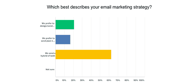
Image courtesy of Databox
The above chart comes from analytics brand Databox. In it, it shows that most companies, 62 percent, rely on both HTML and plain text emails in their marketing campaigns.
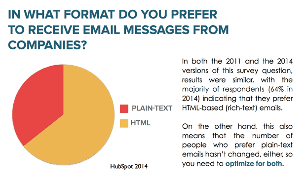
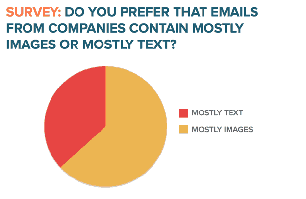
HubSpot, in a post from 2014, found that its audience of more than a thousand names in sales and marketing liked HTML over plain text.
Images courtesy of HubSpot
HubSpot does go on to say that when they A/B tested their own emails for their specific audience though, that same audience preferred more stripped back emails. You know, ones with less HTML, like plain text emails.
Which type of email delivers better email engagement rates for your business? Surprisingly, it’s plain text emails, says 2017 data from Marketo. They did a series of email drops, five total, to see which type of email their audience responded to better. With a statistical significance of 95 percent, Marketo said plain text emails had an improved click to open rate of 11 percent over HTML. Also, with a statistical significance of 86 percent, plain text surpassed HTML in click-through rates at eight percent higher.
Now, a click to open rate or CTOR isn’t the same as an open rate. CTORs track the interest and engagement of the email via unique opens and clicks. Open rates, on the other hand, are just how many people opened the email. In Marketo’s research, the open rate for plain text and HTML emails remained the same.
Also, Marketo does go on to say this about their study: “95% statistical significance for click to open rates is at the low end of the spectrum, meaning I wouldn’t be confident calling it a better email.”
That said, in this instance, plain text emails did technically outperform HTML. While that doesn’t necessarily make plain text your best option, it shows these emails can do even better than graphics-heavy HTML in some cases.
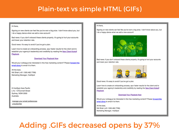
HubSpot, in the article we linked to you before, makes a similar case for plain text. Here’s an overview of some of their more interesting findings.
Images courtesy of HubSpot
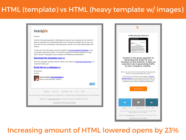
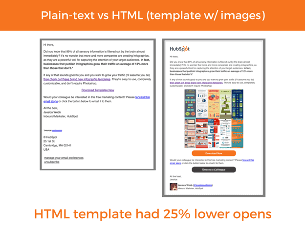
Again, you might have to collect your jaw off the floor after looking through the above images. HubSpot discovered that when they added HTML elements to their emails, they saw an open rate drop of 23 percent with the more elements they had. If they used an HTML email template over a plain text one, again, open rates suffered by 25 percent. Even adding GIFs didn’t seem to help. Open rates were dented at a significant rate of 37 percent by loading some GIFs into an HTML email.
We do want to stress that these results are a few years old and from a particular audience that HubSpot surveyed. Thus, the data may not be indicative of everyone’s feelings on HTML vs. plain text emails. That said, two major marketing brands have found through their data that plain text emails can outshine HTML in a handful of instances.
Not like this necessarily matters, as you’re not supposed to exclusively send HTML or plain text emails for the success of your email campaign, as we said. You want a mix of both.
The Benefits of Both Email Types
The point of this article wasn’t to position plain text above HTML or vice-versa. That’s why, in this section, we’ll lay out the benefits of both email formatting types.
HTML Emails
HTML-Enabled Click-Through Tracking Gives You Convenient Results
By using HTML in the email body, you can review how many click-throughs your emails get with an enabled feature. You don’t get to enjoy that same kind of benefit with plain text. We do want to say that, while this feature is handy, you’ll still have to manually check open rates as well. After all, both metrics matter.
Your Readers Can Click Buttons and Hyperlinks
Plain text emails and hyperlinks don’t really play well together. Instead, if you wanted to share a link, you’d have to copy and paste the whole thing, warts and all. This can look kind of ugly, dragging down the already unappealing plain text emails to new depths of eyesore.
With HTML emails, there’s no need to worry about such a thing. You can use hyperlinks or, if you prefer, buttons your readers can click.
Your Audience May Find These Emails Simpler to Read
Since your customers are busy people, we can’t promise they’ll read every last word of your emails. By using HTML formatting, though, you can divide your content up into smaller chunks that don’t take nearly as much effort to glance over.
HTML Gives You the Freedom to Personalize Emails
By dividing your audience segments, you can continue adding a deeper degree of personalization through HTML emails. From making offers to certain audience segments to altering email color or design based on your audience members’ preferences, you can do it all.
Plain Text Emails
Plain Text Feels More Intimate and Personal
Speaking of personalization, just because you can’t customize the look of plain text emails doesn’t mean you can’t personalize them. The very nature of these emails comes across as incredibly intimate.
When you take away all the graphics and buttons and design elements, you’re left with a simple email message. The content, often conversational in nature, makes the reader feel more like they’re enjoying a catchup with an old friend instead of getting a sales pitch. It’s hard (but not impossible) to achieve the same results with HTML emails.
These Emails Are Surprisingly Ahead of Their Time
While plain text emails may look like a relic from the ‘90s, they’re actually more ahead of the curve than you’d expect. With devices like smartwatches and fitness trackers rising in popularity, this tech lets you check your email now, too. The problem? With such small screens, emails can often only show text on these devices. That makes plain text emails a perfect fit.
Your Messages Have a Better Likelihood of Going Through, at Least on Gmail
No matter how well-packaged your email, if it never arrives to the recipient’s inbox, then the design doesn’t count for anything in the end. Gmail, which TechJury says has 1.2 billion members as of last year, has strict criteria for which messages end up in an inbox versus the spam filter.
Since companies trying to promote themselves have used images in emails for as long as anyone can remember, Gmail sometimes still sends HTML emails to the trash as spam. That won’t happen with plain text.
Conclusion
The next time you go to compose an email, you may wonder, should you use HTML or plain text? The answer is a mix of both. While the email graphic content of HTML has an instant, undeniable appeal, it doesn’t always perform as well as plain text. That said, plain text emails can suffer from looking boring, even if they do ratchet up the personalization and intimacy.
If you’ve only ever used HTML emails, try adding plain text ones to your campaign and see what happens. We’re sure you’ll like the results.


